

Our brand manager's chance encounter with an eCommerce website sparked the initial discovery. To his surprise, he found a third-party retailer mirroring the services provided by our official Goodnites website. After sharing this with our team, it ignited a conversation about improving our 'Buy Online / Find Near Me' feature.
Despite debates regarding the retailer's website compliance with our legal policies, the business team valued the direct product display to users upon page arrival. This inspired them to champion the integration of this feature into our new design.


Problem
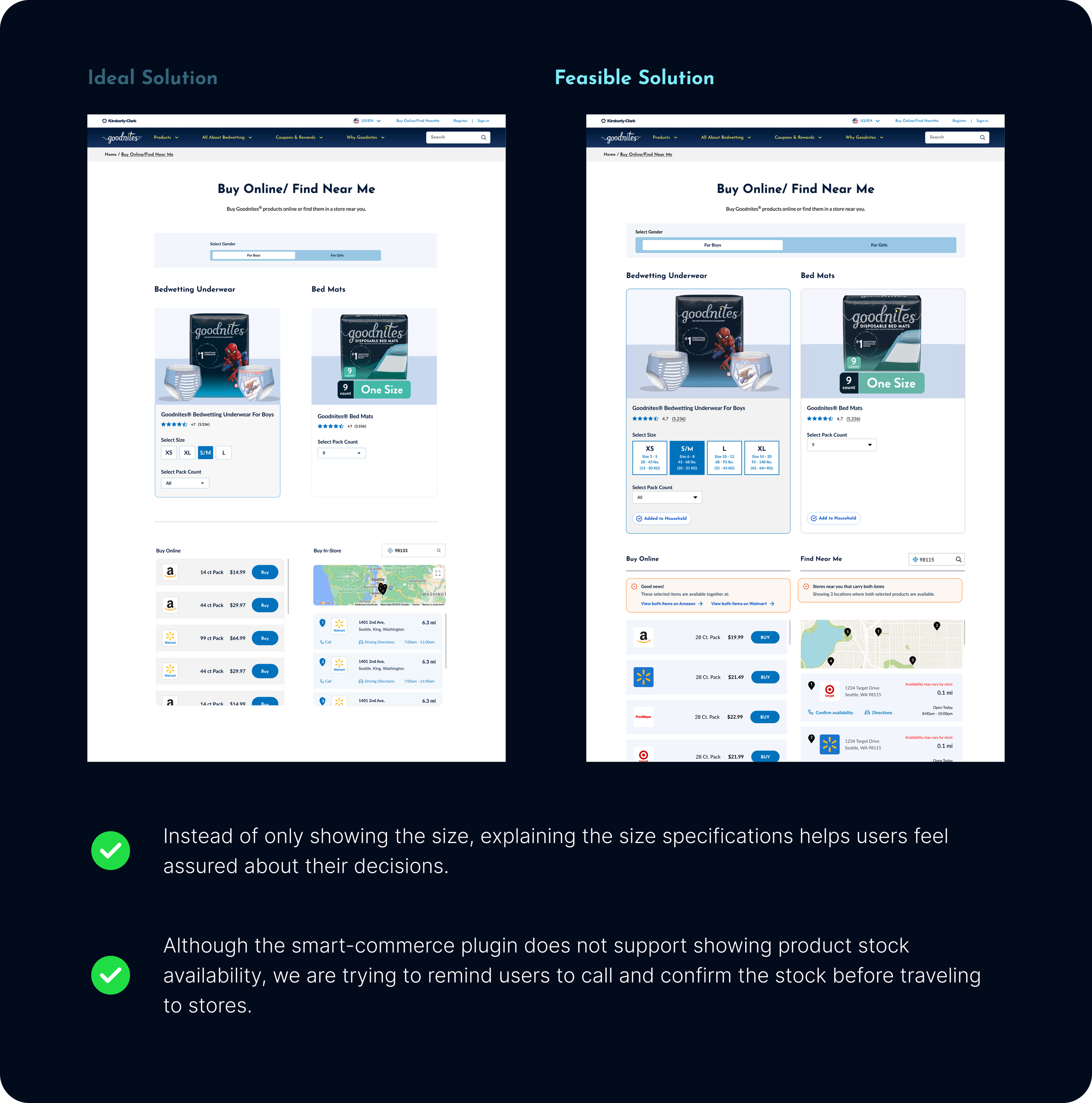
From a UX standpoint, our prior 'Buy Online / Find Near Me' page required users to input their needs before displaying products, ensuring precise, user-centric results. Initially, this led to confusion about the business direction, but market research helped us achieve alignment.


Prepopulated inputs and results help users understand what to expect and the value of this feature.
A product package shot serves as an engaging visual element that captures users' attention for extended page visits.
Assuming customer interest in the default product automatically may lead to frustration when they are seeking alternative options.

Design Variation
The existing design system and component library for the Goodnites website streamline the design process, enabling a swift progression to high-fidelity solutions. This approach allows for a heightened focus on functionality without major alterations to the brand's established look and feel.


Iteration Goal
Streamline the buying flow to minimize the users' effort in finding the right information and in the clicking process.
Make the information displayed on pages more concise to mitigate distractions and help users focus on the buying actions.


User Feedback
From 12 unmoderated user testing sessions, we are collecting information to determine if the new design provides users with enough information and an intuitive interface to accomplish 'buy online' and 'find near me' actions.

Design Actions
Size guide information helps users decide when they need to change sizes.
Compare prices between online and in-store.
Show in-store availability in the 'find near me' section.

Post Development
The new 'Buy Online' design serves as an experiment for other brand websites to test a similar strategy of automating the purchase flow, aiming for a more streamlined 'Buy Online' and 'Find Near Me' experience. Monitoring performance is crucial to assess its effectiveness and inform future iterations.
Project Goal 1 - Achieved
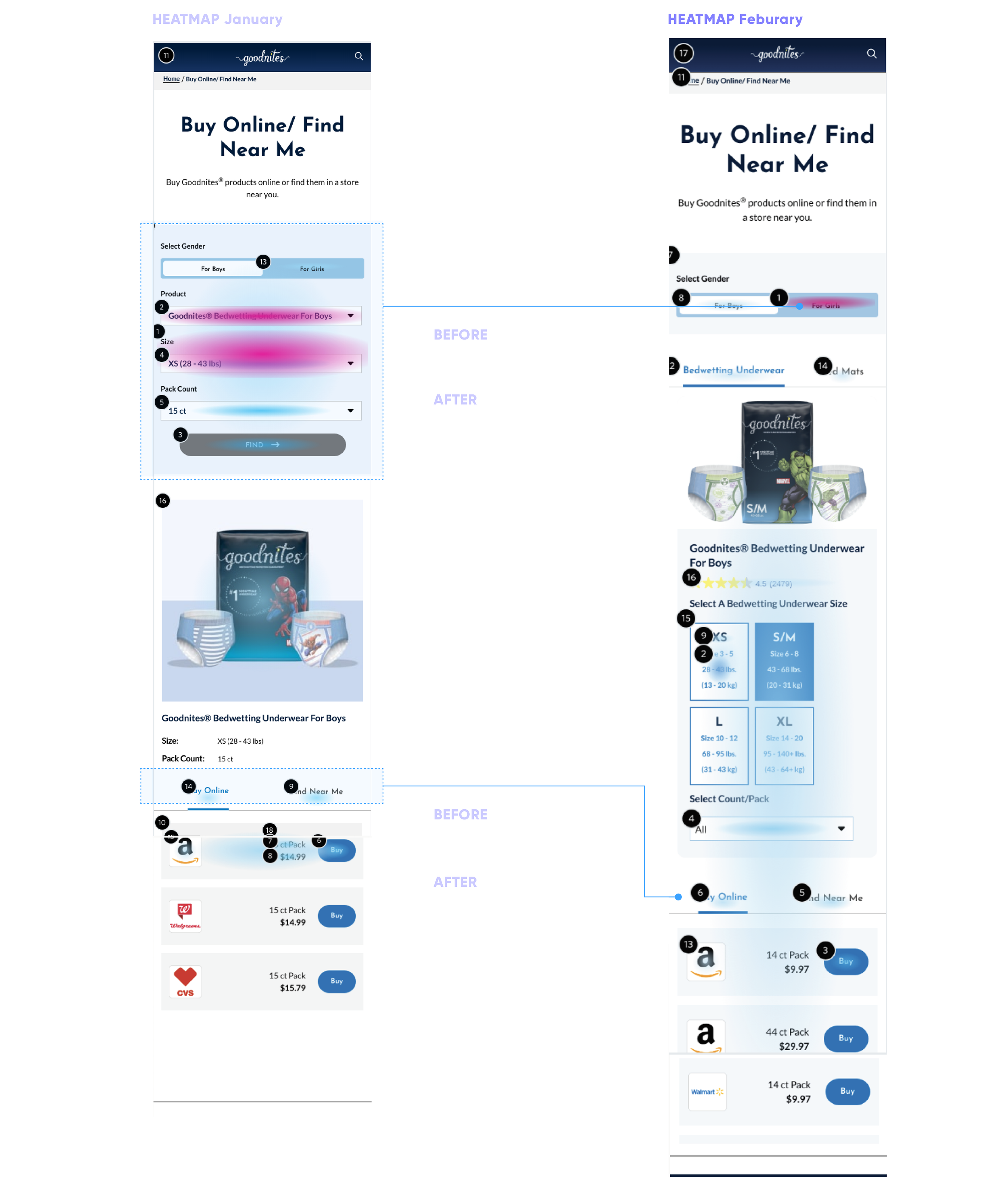
From the heatmap, it is evident that users are engaging more with information related to products and buying actions instead of focusing most of their attention on setting up the selection criteria.


Project Goal 2 & 3 - Achieved
With fewer clicks and simplified project filters, the customer conversion rate increased from 3.57% to 15.66%, and the conversion time decreased from 34.23 seconds to 26.99 seconds.


The Next Step
Besides the features we know users would like to have from research but are currently infeasible, there is one additional factor that influences the user conversion rate: whether the customer is first-time or existing.

The 'Buy Online / Find Near Me' feature is designed for existing customers to quickly access the website and purchase products they are already familiar with. Therefore, the design is more concise compared to the product description page, which introduces the product to new customers.


Opportunities
The first-time user journey, consistent across all Kimberly-Clark brand websites, including Goodnites, Huggies, Kleenex, and Pull-Ups, highlights the need for a more structured and tailored user flow. This approach would guide users with varying objectives toward accessing relevant information, thereby enhancing the effectiveness of the turnover rate.
In addition to the existing website user flow, implementing the new 'Buy Online' feature on other brand websites poses a significant challenge, especially for brands with extensive product lines like Huggies, in comparison to Goodnites. Identifying a method that allows users to control their viewing of products without overly depending on product filters is a challenge that needs resolution in the future.