

The Kimberly-Clark website currently lacks a deep understanding of its target audiences, fails to meet visitors' specific information needs, and suffers from design inconsistencies that do not align with UX industry standards. Our objective is to implement a data-driven decision-making process to overhaul the user experience, ensuring the website is visually appealing, modern, and aligned with contemporary design trends.


01
01
Research
Exploratory Research
Heuristic evaluation
02
First-hand Research
Unmoderated survey
03
Insights Analysis
Pain points prioritization
Heuristic Evaluation
Kimberly-Clark.com is a vast website, and before we delve into user research, it's crucial to identify potential issues. This understanding will help us develop a framework for preparing questions to ask during user testing, allowing for problem validation and gathering more detailed feedback on the identified issues.


User Control and Freedom
Broken breadcrumb incorrectly directs users to a new page, failing to track their navigation history. Left navigation menu changed page by page.

Consistency and Standards
Inconsistent button font sizes. Varied metric box colors, placements, and clickability options.
Summary:
Low resolution images
Inconsistent design elements: color, font, spacing, styles
Confused navigation pathways
Unintuitive controls: button status
Valuable information is burried down in the pages cause it hard to find
Terminolgies and abbreviations are hard to understand
01
02
User Testing

The insights from the heuristic evaluation inform our user testing scripts, enabling us to validate assumptions and thoroughly assess the details and severity of the pain points users encounter.
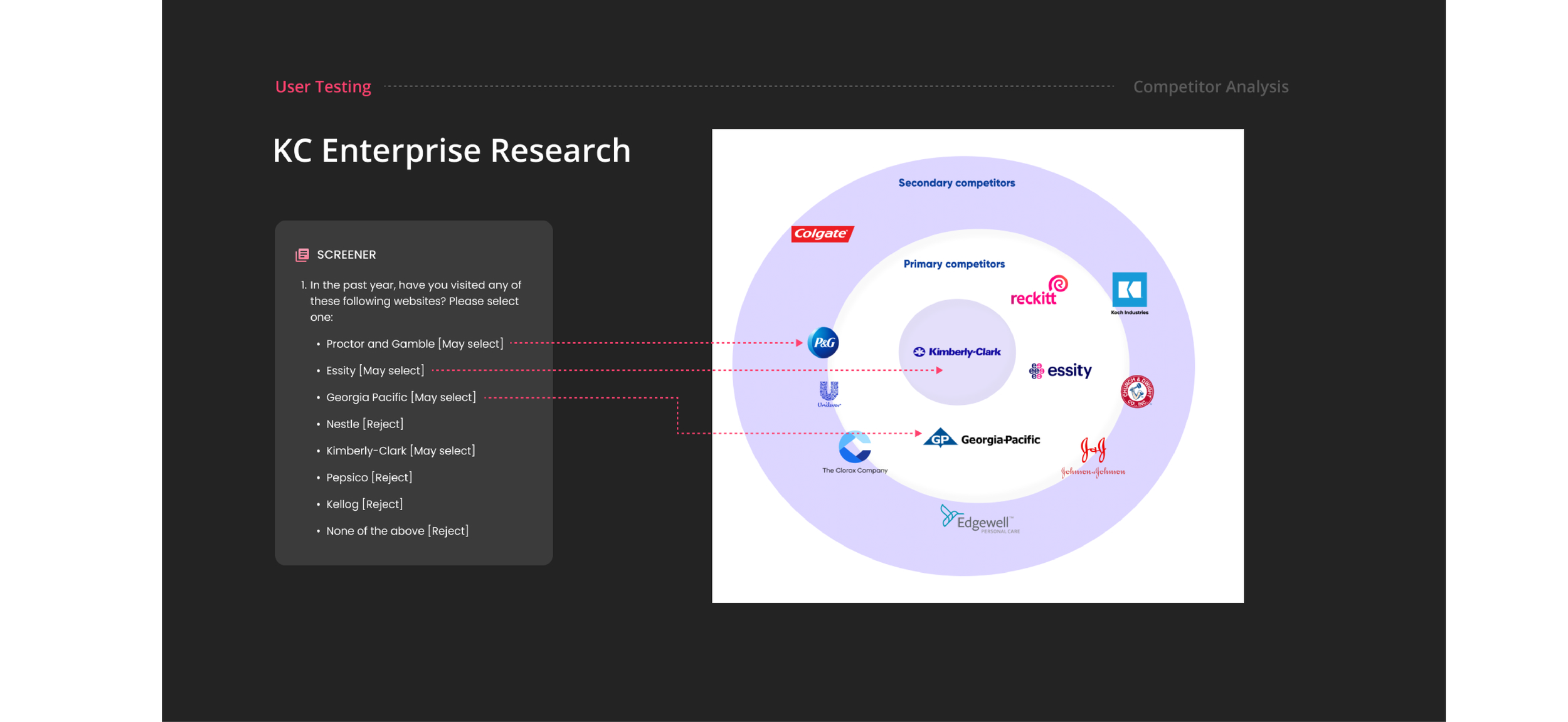
Screener
50 qualified participants are selected for the test
Companies like Colgate enjoys strong name recognition, while Kimberly-Clark's name is less directly associated with its products name, leading to drastically different user demographics and expectations when visiting corporate websites.

Navigation Tasks
One of the task: Please navigate from home to find information you are interested with.
We aim to evaluate two things: The navigation effectiveness and the information relevance
Overall Impression
Rate website performance, content, readability and visual layouts.
After navigating the website as part of the previous task, users will gain a better understanding and be able to provide more informed feedback on the overall website flow, UI, loading times, and UX writings.
02
03
Insights Analysis
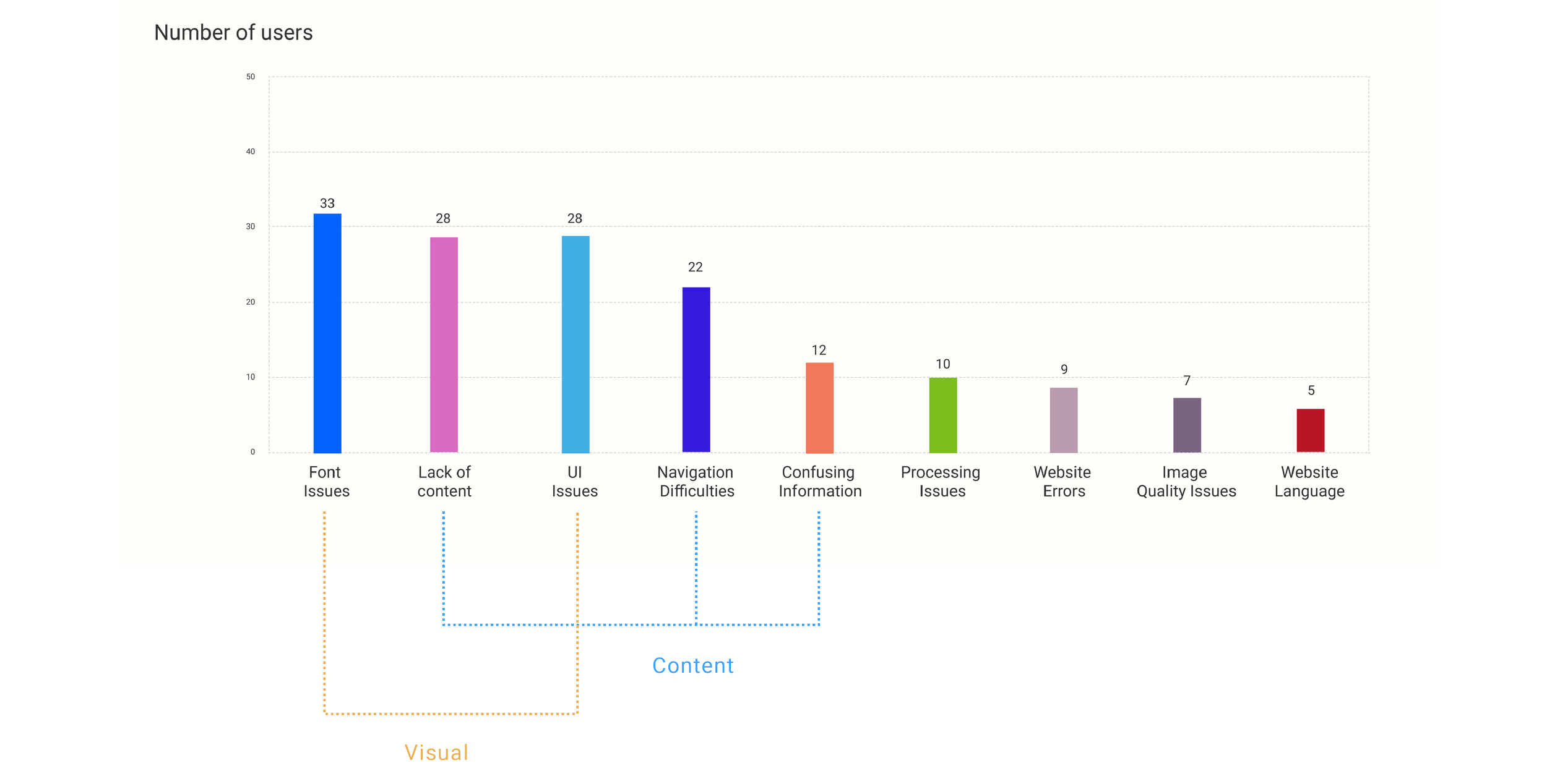
Leveraging the findings from the heuristic evaluation, we designed and conducted user testing to address each evaluation bullet point, validate our assumptions, and analyze insights from excel raw data to affinity map while ranking the severity of user pain points.


We have identified 153 pain points that users are currently experiencing, with the majority of these issues being related to the website's UI and content. Specifically, among these pain points, 33 are related to font size concerns, while 28 are requests for more detailed content.

High level pain points:
Overcrowded and inconsistent layout
Lacks engaging, easy-to-understand content
Difficult navigation and user journey tracking
Small font size causing readability issues
Hard to find relevant information
Lack of originality
Color contrast accessibility problems
01
Actions
By consolidating all the pain points we have two directions need to tackle in design process:
03
Content
1. Help users learn more about company and its products
2. Ensure content is engaging and easy-to-understand
3. Ensure intuitive navigation to improve content access
Visual
1. Improve readability
2. Innovative and consistent style
3. Clean and organized layout
4. Appealing graphics/elements to retain user attention.

01
01
Design
Content Strategy
Competitor Analysis
Wireframes
02
Design Ideation
Prototypes
Iterations
03
Design to Dev
Annotation
QA & Accessibility audit
Content Strategy
To identify which content should be prioritized and which content is missing we audited the information from industry competitors website and find some trends:

What does user trends show us?
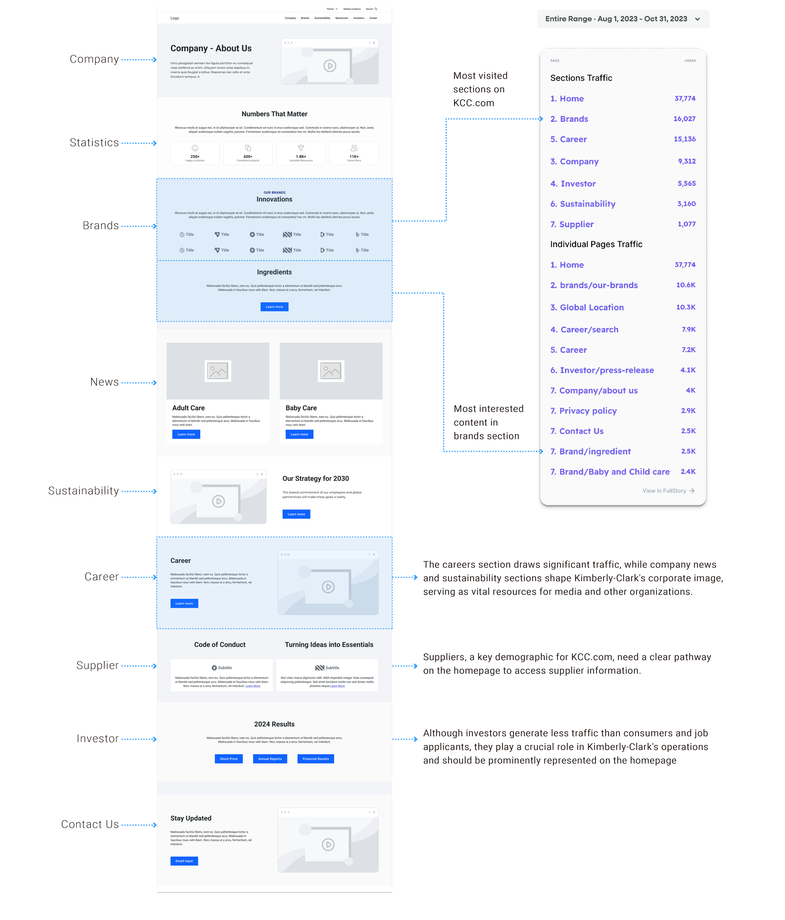
While most consumer brands prominently display company history and investor information, such as quarterly results and stock prices, on their homepages, we cross-referenced these trends with the most visited pages of KCC.com. This allowed us to align industry trends with user interests.
Most visited pages on KCC.com

01
Content directions:
The user traffic suggesting investor and company introduction are areas users are interested in which validate the industry trends and provide solid direction for the homepage content strategy of adding:
01
Company “About Us”
Highlight Kimberly-Clark’s mission, products and values.
01
Investor Reports
Present stock price, financial results and links to reports for investors
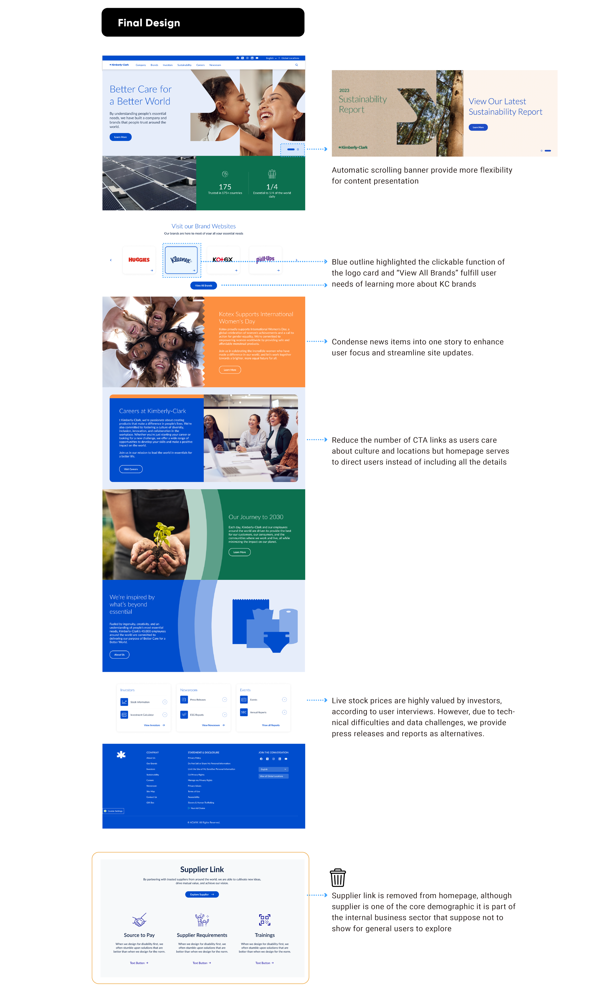
Wireframes:
We used wireframes here as a quick tool to map out content on each page based on competitor analysis and website traffic data. Content with higher user engagement get higher priority and we are making sure each user groups are being represented on the homepage include investor, suppliers, job seekers and consumers .
02
Design Ideation
Following the content strategy defined in wireframe the home page design is explored in multiple variations to address the design issues of :

Inconsistent layout
Component and interaction inconsistency

Lack of visual originality
Lacks unique interpretation of Kimberly-Clark's core values.
Lack of user empathy
Design style needs to reflect content and connect with users
Business passive approach:
The design inspiration is mainly coming from corporate new brand guideline that is shared with us. The business put the project on hold for 3 months while the brand guideline is in work in progress.

Although there is a dependency of waiting for agency finishing brandings and business cooling off from close collaboration on pushing the project forwards. As the first to see the sneak peek of the new brandings we are excited to apply the colors, fonts and vector arts in the design working ahead of the timeline and driven the project forward by showing high-fidelity design for review and feedback.
02


02
What we did during the 3 months on hold time…
Despite the business team's passive approach and lack of communication on further directions, we proactively pushed the design forward. We explored numerous variations and conducted internal reviews to ensure alignment with our design goals of consistent layout, originality, and user empathy.
Our efforts centered on reinforcing brand imagery by avoiding repetitive layouts and colors, drawing inspiration from brand guidelines instead of competitor sites, and carefully choosing fonts and imagery to create a deeper emotional connection with users."
02
Reviews and Critiques
We internally reviewed the design variations at the component level, comparing similar sections to select the best elements from each. These selections formed the basis for our iterative design process.


Selected Options
After an internal review of each section, we selected the best options and combined them into two proposals for stakeholder review.

02
02
Business Review
Overall, stakeholder feedback on the two options has been positive, but there are feedback regarding technical feasibility and business concerns that need to be balanced with user needs.
03
Design to Development
Although the design was approved by the business, it is not the final version. Improvements are being made during QA and accessibility checks. These issues are documented and created as ADO tickets for developers to address, ensuring continuous improvements until the final launch date.

03
Documentation
Although the design was approved by the business, it is not the final version. Improvements are being made during QA and accessibility checks. These issues are documented and created as ADO tickets for developers to address, ensuring continuous improvements until the final launch date.
Atomic Design System
The design system is developed incrementally, with each page approved and finalized throughout the process.
Component mapping for Kimberly-Clark.com highlights component usage on each page, helping the engineering team estimate workload and plan development effectively.
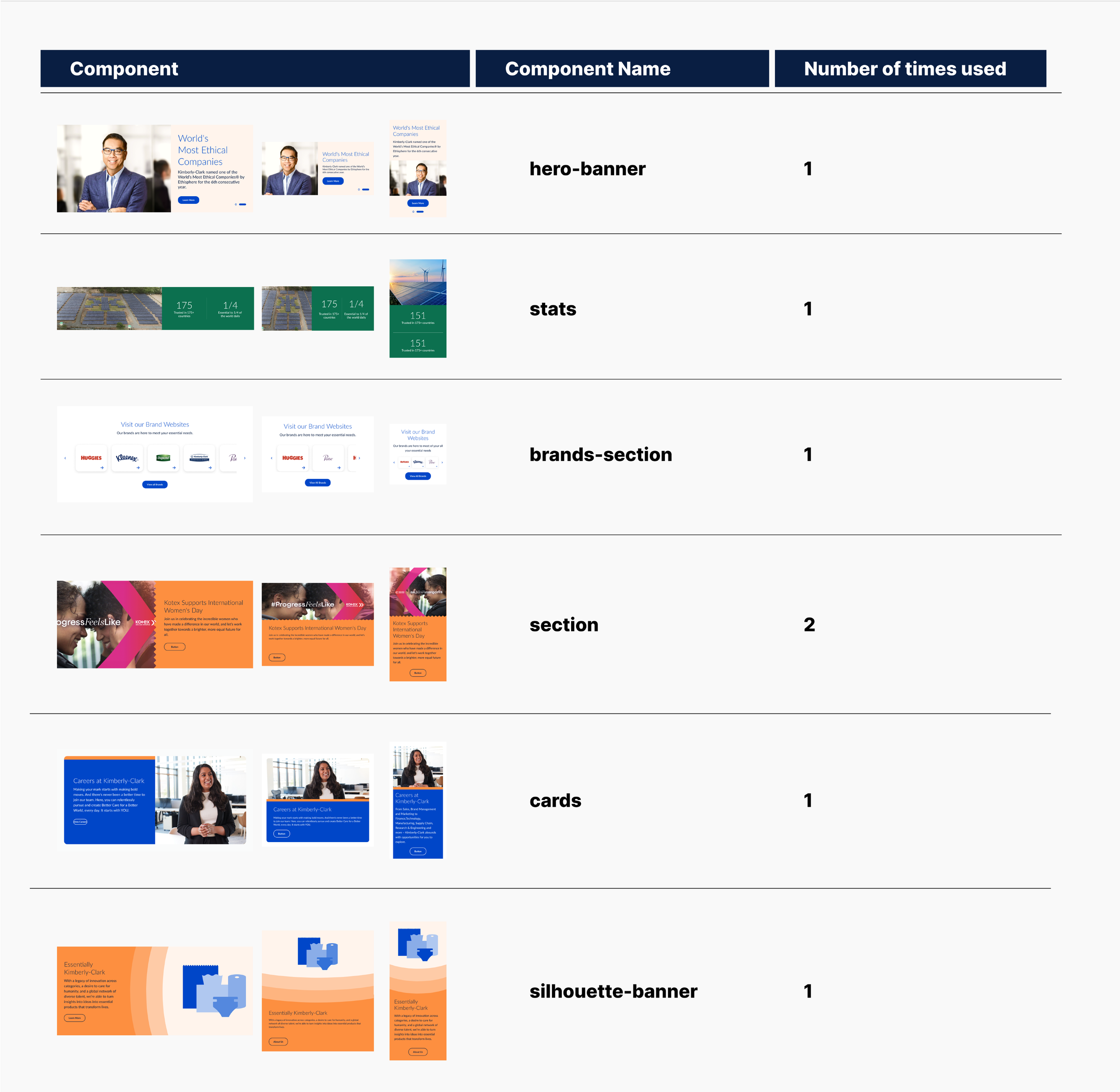
For complex component to ensure development accuracy, annoation is provided:

03

01
Next Step
Behavior Analytics
User engagement
Content fulfillment
Visual consistency
02
Continous Improvement
Interaction
User flow
Accessibility

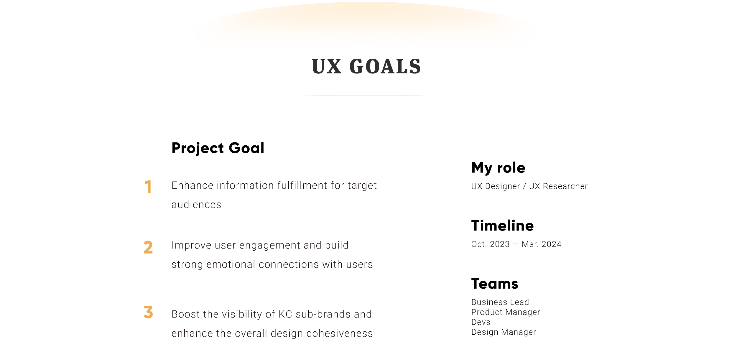
Success Metric:
Improve user engagement and build strong emotional connections with users
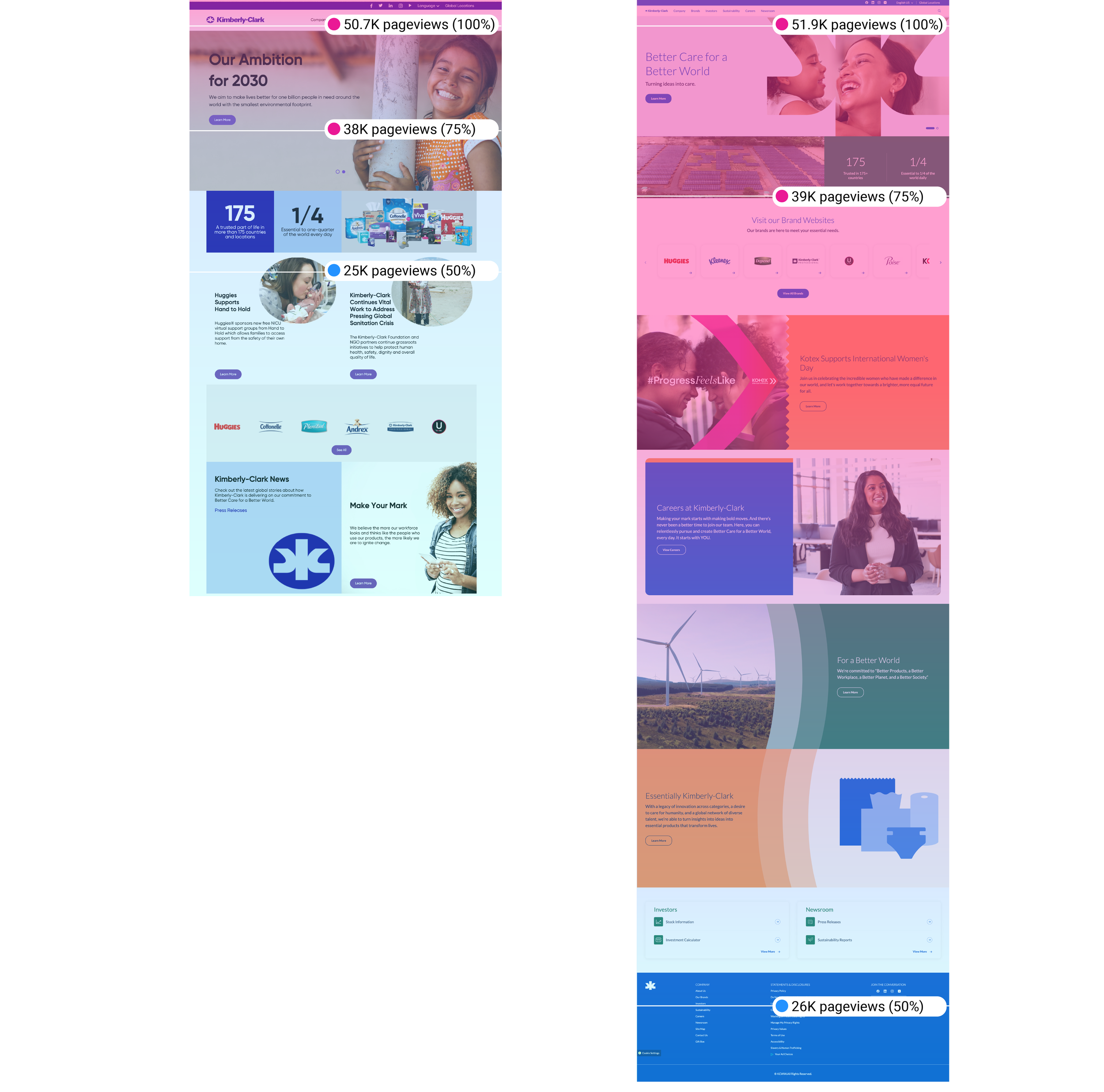
Users are engaging more effectively with the KC website, with 50% scrolling to the end of the page, indicating that the new design and content on homepage aligned with user needs.

Success Metric:
Enhance information fulfillment for target audiences
User traffic across all scenarios improved with the new design, demonstrating its effectiveness in representing diverse user groups and driving traffic to detail pages, helping users from different backgrounds stay informed.
Continous Improvement:
UX content writing for the sustainability and innovation sections needs improvement to enhance clarity.
Additional research on trending news is needed to boost traffic in the newsroom section.

Success Metric:
Enhance the overall design cohesiveness
User traffic across all scenarios improved with the new design, demonstrating its effectiveness in representing diverse user groups and driving traffic to detail pages, helping users from different backgrounds stay informed.
Continous Improvement:
The first round of design scope have some pages not including in the project scope either due to the timeline limitations or business intentions of having agency designed the pages. Those pages need to be redesigned to align with KC brand imagery.

Further Steps
Working with SEO team to determine key taxamony and UX writing strategy to boost organic search traffic from search engine which will impact certain design components that has hovering over, expand and collapse and ebook feature that are not showing full information to users directly.
The KC corporate site uses its own design system, while other brand sites like Huggies, Depends, and Poise share a unified system. To ensure scalability, the corporate design should be integrated into the master system, balancing user experience with minimizing development costs.
Conduct user testing on the new site to identify specific needs within key sections like Brands, Sustainability, and Newsroom. Focus on each scenario rather than just overall impressions, and implement solutions to continuously enhance the corporate site’s user experience.